Cold Static
UI/UX & Audio Design
Project Overview ❄️
Cold Static is a PSX-inspired narrative horror game set inside a cold, brutalist radio station. Players step into the role of a vinyl DJ, to host a popular broadcast while uncovering the town's dark mystery.
The Challenge
Working alongside a 6 person team, I set out to create a cohesive UX/UI system that balanced usability with Cold Static’s visual language, while remaining achievable within the rapid development cycle of a one-week game jam.
Figma, Illustrator, Photoshop,
Logic, Unreal Engine
Project Length: 1 Week
UX/UI Design 🎮
Visual Design 🖼️
Developed the visual direction for the interface, including typography, layout, iconography, textures, posters and overall UI language.
Audio Design 🎧
Created custom sound effects and audio feedback for UI interactions and atmosphere.
Music Composition 🎼
UX Ideation!
Dialogue Exploration
Since we decided on a narrative experience, dialogue was one of the first systems I explored and prioritized. I tested several approaches to placement, scale, character identification, and player responses before settling on a direction that worked within the game’s visual style and player camera.
Concept 1


Concept 2


Concept 3


Concept 4


Concept 5


The Chosen Direction
After exploring several dialogue wireframes, our team chose this direction because it best balanced readability, our chosen visual identity, and immersion. Keeping the dialogue close to the speaker helped preserve visual context while avoiding a more traditional full width dialogue box that felt disconnected from the game’s world.
Once the direction was established, I worked closely with our lead programmer to bring the dialogue system into the game, refining the UI assets and interaction flow as we implemented it.
Record Select Exploration 🎵
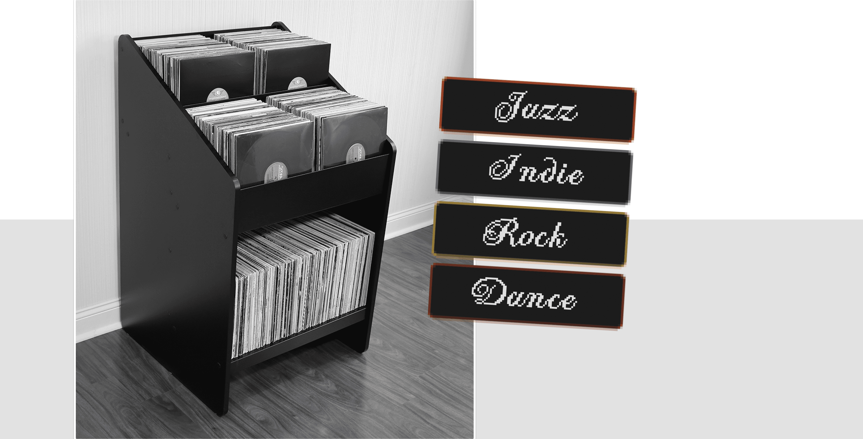
One of the systems we explored was how players would select records in-game. Since selecting and playing music is such a core mechanic, we aimed to make the interface of the selection enjoyable, intuitive, and part of the world.
Initial Direction
The first concept approached record selection as a more traditional interface system, prioritizing clarity and quick readability and interaction.

Moodboard
I gathered references across environment design, typography, visual elements, colors, graphic design and user interactions from some major influences to establish a visual language that felt cold and grounded within Cold Static's brutalist world.

Style Guide
Using those moodboard references as a foundation, I developed a cohesive system for typography, color, layout and interface elements that could be applied consistently throughout the game.

Bringing the Interface to Life 🫶
Once the core system was designed and established, I worked very closely with our lead programmer to then implement the interface in Unreal. The focus was then shifted to how the interface behaved in motion, responded to player input, and how it existed in the world.
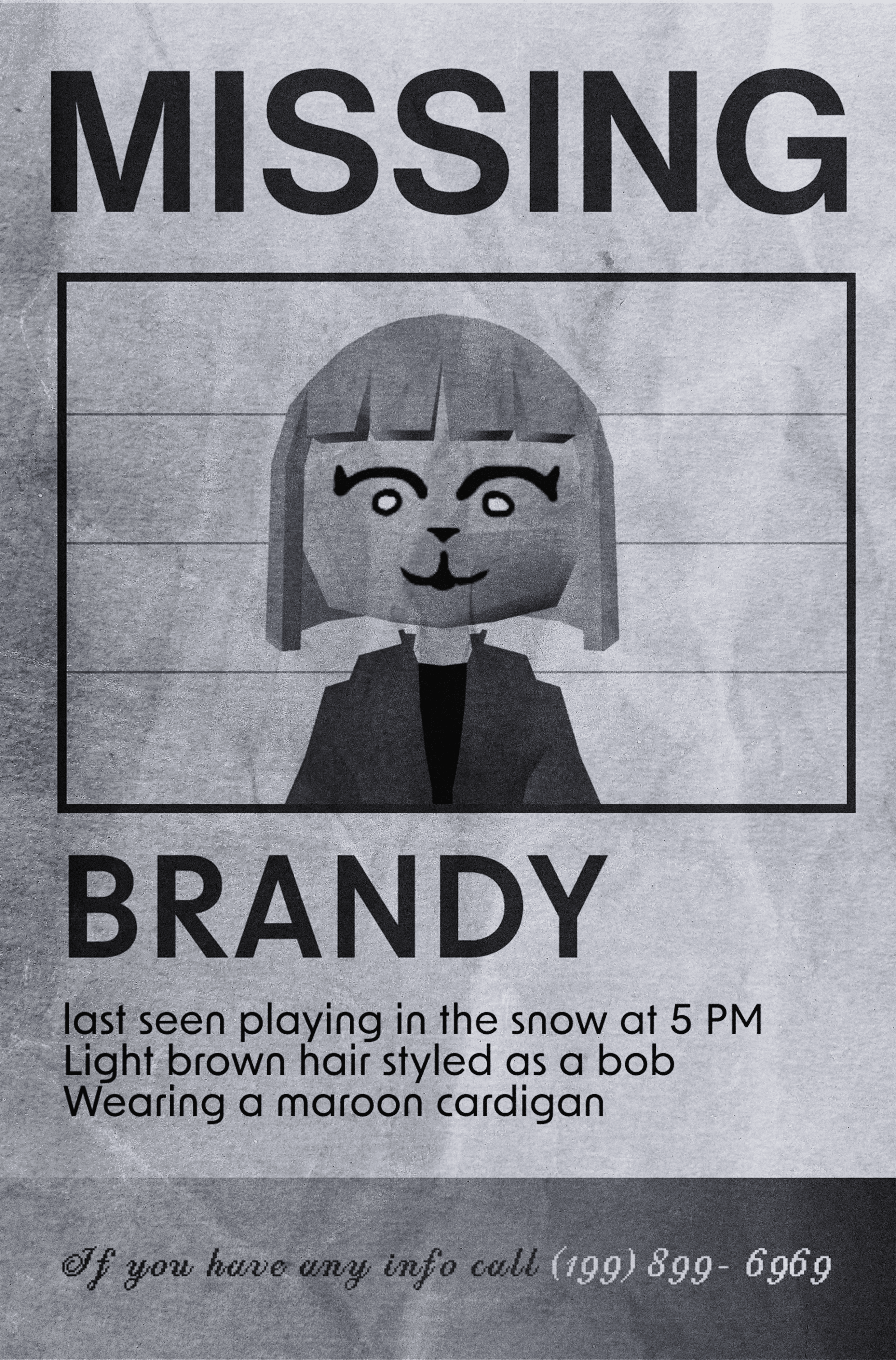
On top of the UI/UX Design, I also created lots of visual assets that helped define the world and atmosphere of Cold Static. Including logos of the radio station for branding and parody like posters and designs for ironic promotional pieces, aiming to fit this dystopian brutalist feel.




Alongside the UI and visual design assets, I composed 20 tracks of original music for the game to help define the mood of the world and the radio station record selection. All written and recorded within 1 week, including tracking of guitar, bass, drums and keys.
Ambient (Atmosphere)
Rock Track (Vinyl)
Indie Track (Vinyl)
Dance Track (Vinyl)
Jazz Track (Vinyl)

Outcomes!
My Experience ⭐
Working on this game jam and building Cold Static was one of my most collaborative design experiences to date. Building a playable game in seven days meant making and executing design decisions quickly.
Wearing multiple hats and taking on several roles on top of UX/UI pushed me to think about the player experience as a complete package rather than just one aspect of the game.
This project has reinforced how much stronger User Interface design can be when it is developed closely with gameplay, environment, sound, feel and narrative.
Post-Mortem
I'm very proud of our team, in a 1-week game jam we set out to be incredibly ambitious and spent sleepless nights designing, building, and working through multiple iterations. It was so cool and rewarding seeing our early ideas work but then inspire us to expand and make them better, such as the record selection UI.
I've learned a lot when it comes to refining UI readability, interaction feedback, visual consistency that matches the game's world, and the balance between traditional interface elements and spatial/diegetic design. Loved every bit of working on this with my team!
Play the Prologue! > COLD STATIC